

Thank you for purchasing Conduit:OS! We’re excited to help you bring your next SaaS or technology website to life. This template gives you a polished starting point while leaving plenty of room to make it your own.
Conduit:OS is built with reusable Webflow sections and components, a centralized Variable Library, and a consistent class structure. Animations combine native Webflow interactions with a small number of custom GSAP scripts. Selected sections also use Spline scenes, Rive animations, and Lenis smooth scrolling.
This guide explains how to customize those systems without disrupting the template. Use the navigation to jump to a topic. Where it’s easier to show an edit than describe it, screenshots will point you to the right place in Webflow.
We recommend making a backup before significant changes. Start with the Variable Library when adjusting global colors, typography, or spacing. If you plan to change an animation, review its instructions before renaming classes, removing elements, or changing custom attributes.
Conduit:OS uses Webflow Variables to keep its visual system consistent across the template. Instead of editing colors, fonts, or spacing on every element individually, you can adjust shared values in one place. Any styles connected to those variables update automatically.
Open your project in the Webflow Designer and select the Variables panel in the left sidebar. You’ll find four collections, each responsible for a different part of the design system. Select a collection, then edit the value of the variable you want to change.
This collection contains the three font families: Funnel Display, Questrial, and JetBrains Mono, along with shared font weights and the main 1,440px container width. Change these when you want to update the template’s foundational typography or overall content width.

This is where you customize the overall color palette. Main Colors include Almost Black, Alabaster Grey, Toasted Gold, and Lavender. Secondary Colors contain the supporting shades and transparent variants, while Utility Colors cover critical, warning, success, and informational states. Updating a color variable affects the elements that use it.

The Text collection controls typography for headings, paragraphs, hero titles, CTA titles, and smaller interface text. It includes font size, font family, weight, line height, and letter spacing. Many heading sizes are linked through calculated values and text-scale factors, so changing one variable can influence several text styles. You can also use its Tablet, Mobile (L), and Mobile modes to adjust typography for smaller screens.

This collection organizes spacing into Mini, Small, Medium, and Giga scales. These values are used throughout the design for padding, margins, and gaps. It also includes layout proportions based on a 16-column system. When adjusting spacing, reuse these variables rather than replacing them with individual pixel values.

Variable changes can affect multiple pages and components at once. Make adjustments carefully and check the results at different breakpoints before publishing. For one-off changes, edit the relevant element’s styles rather than changing a shared variable that other elements depend on.
Conduit:OS comes with Lenis Smooth Scroll already integrated, bringing a more fluid, polished feel to the entire browsing experience. Instead of abrupt scrolling, pages respond with subtle, controlled motion that makes exploring your content feel more refined. The library, stylesheet, and initialization are included and ready to use, giving your website an extra layer of premium interaction without having to build a smooth-scrolling system yourself.
Lenis smooths wheel-driven scrolling by gently interpolating between the current scroll position and the destination. This creates a more consistent, fluid response without replacing your site’s content or adding animations to individual elements.
A small requestAnimationFrame loop keeps Lenis scrolling smooth. Lenis handles scrolling, while GSAP and native Webflow interactions control effects such as number counters, word reveals, and progress bars.
The template already includes the Lenis library and its accompanying stylesheet in Site Settings → Custom Code → Head Code. These two resources make Lenis available to the website and provide the recommended scrolling styles.
The exact header code used by Conduit:OS is shown below. You do not need to add it again unless you remove or replace the existing installation.
<!-- Lenis script and styles -->
<script src="https://unpkg.com/lenis@1.3.4/dist/lenis.min.js"></script>
<link rel="stylesheet" href="https://unpkg.com/lenis@1.3.4/dist/lenis.css">Lenis is activated in Site Settings → Custom Code → Footer Code. This initialization creates the smooth-scroll instance, defines how the scrolling should feel, and updates it continuously with requestAnimationFrame. It runs site-wide, so no individual page setup is required.
The complete footer code below is already installed in Conduit:OS. It is included here as a reference for customizing the effect.
<script>
  const lenis = new Lenis({
    smooth: true,
    lerp: 0.1,
    wheelMultiplier: 0.5,
    infinite: false,
  });

  function raf(time) {
    lenis.raf(time);
    requestAnimationFrame(raf);
  }

  requestAnimationFrame(raf);
</script>In the footer script, lerp: 0.1 controls how quickly scrolling catches up with the visitor’s input. A lower value produces a softer, more gradual response; a higher value feels more immediate. The default is balanced for the template, so make small changes and test the result.
The wheelMultiplier: 0.5 setting reduces how far a mouse wheel scrolls per input. Increasing it makes wheel scrolling cover more distance, while decreasing it makes the movement more restrained. The infinite: false setting keeps normal page boundaries rather than looping endlessly.
The animation loop at the bottom of the script is essential for this setup. Keep the raf function and its requestAnimationFrame calls intact when changing the settings; the values inside the Lenis configuration are the ones intended for adjustment.
Lenis is installed globally through the site’s custom code. That means new pages automatically use the same scrolling behavior; no custom attributes, classes, or extra embeds are required. You can keep designing new pages normally in the Webflow Designer.
Because Lenis handles the scrolling experience and GSAP handles content animations, you should test any major scroll-triggered changes on the published or staging site. Avoid adding a second smooth-scrolling library or another Lenis initializer without deliberately replacing the existing one.
If you prefer native browser scrolling, remove or disable the Lenis initialization script in Footer Code. The rest of the template’s GSAP animation scripts can remain in place. If you no longer use Lenis anywhere, you can also remove its library script and stylesheet from Head Code to avoid loading unnecessary resources.
When testing a change, publish the site and check scrolling on desktop and mobile. Keep a copy of the original header and footer snippets if you might want to restore the effect later.
First, confirm the Lenis JavaScript and stylesheet are still present in Head Code and that the initialization script is present in Footer Code. If the browser reports that Lenis is undefined, the library may not have loaded before the initializer.
If scrolling feels too slow or too loose, adjust lerp and wheelMultiplier in small increments. If scrolling conflicts with another interaction, check for duplicate smooth-scroll scripts or competing scroll controls. Always test the published result across your intended devices; touch scrolling may retain the device’s native behavior.
The remaining custom GSAP scripts are in Site Settings → Custom Code → Footer Code. They include Count Up, Fade In Per Word, and Random Float. Edit their animation parameters here, then publish to apply changes site-wide. The mega menu and SVG progress-bar masks are configured in Webflow Designer rather than custom code.
Conduit:OS uses a lightweight GSAP count-up animation for numerical metrics. The animation changes the number directly with GSAP’s textContent tween and ScrollTrigger. Final values remain editable in Webflow Designer, and an optional attribute controls the delay.
When a number enters the viewport, GSAP animates its textContent from 0 to the final number over 1.2 seconds with power3.out easing. The value snaps to whole numbers, and ScrollTrigger plays the animation once when the element reaches the top 85% viewport trigger.
Select the number element in Webflow Designer, enter its final numeric value (for example, 250), and add the custom attribute count-up with an empty value. Put symbols such as +, %, $, or other text in a separate sibling Text Span or element so GSAP only animates the digits.
To stagger several counters, add the optional custom attribute count-up-delay with a value in seconds, such as 0.4. Omit the attribute or use 0 for no delay. The value is read by the same GSAP animation.
Check that the counter contains only the intended number, the count-up attribute is on that number element, and GSAP with ScrollTrigger is loaded. Do not include + or % inside the animated number itself. After you changed its numeric value(s), update the text in Designer and republish.
<script>
/* CONDUIT:OS - Count Up Animation */

gsap.registerPlugin(ScrollTrigger);

gsap.utils.toArray('[count-up]').forEach(el => {
  const delay = Math.max(0, parseFloat(el.getAttribute('count-up-delay')) || 0);

  gsap.from(el, {
    textContent: 0,
    duration: 1.2,
    delay,
    ease: 'power3.out',
    snap: { textContent: 1 },
    scrollTrigger: {
      trigger: el,
      start: 'top 85%',
      once: true
    }
  });
});
</script>Conduit:OS includes an advanced, word-by-word text reveal designed to give important headlines and statements a more cinematic presence. Rather than showing the entire line at once, each word glides into place and sharpens from a subtle blur, creating a premium motion-typography effect that is already coded and ready to use.
The script uses GSAP SplitText to divide the chosen text into individual words. Each word starts slightly lower, transparent, and blurred before moving into place and becoming clear. A short stagger produces the flowing reveal. Once at least 10% of the element is visible, the animation plays; after it leaves the viewport, it resets so the reveal can play again when the text returns.
In the Webflow Designer, choose the heading or text element you want to animate. Add the main attribute to that element rather than its surrounding section. The script handles the word splitting automatically; you do not need to wrap individual words in spans yourself.
fade-in-per-word — Add to the text element that should reveal word by word. No value is required.
fade-in-delay="0.3" — Optional. Add to the same text element to wait before the reveal begins. The value is in seconds; for example, 0.3 adds a 0.3-second delay.
The code uses yPercent: 25 for the upward movement, blur(5px) for the initial soft-focus effect, and stagger: 0.01 for the time between words. You can adjust these values or the ease: 'power3.out' setting in the script to change the character of the animation.
The script checks visibility with GSAP’s ticker and ScrollTrigger.isInViewport every 0.12 seconds. It also checks whether a Webflow tab pane is active, so the word reveal can replay when the text reappears. There is no IntersectionObserver threshold setting in the current code.
This animation requires GSAP SplitText. Avoid applying a separate opacity or transform reveal to the same text element, since the effects can conflict. For a whole-element fade, use a native Webflow interaction instead.
Check the fade-in-per-word attribute, make sure GSAP and SplitText are available, and confirm the element actually enters the viewport. If the text stays hidden, check for other interactions changing the same words’ opacity or transforms.
<script>
/* CONDUIT:OS — GSAP Scroll Fade In Per Word Animation */

gsap.registerPlugin(SplitText, ScrollTrigger);

const elements = gsap.utils.toArray('[fade-in-per-word]').map(el => {
  const delay = Math.max(0, parseFloat(el.getAttribute('fade-in-delay')) || 0);
  const pane = el.closest('.w-tab-pane');
  let animation;

  SplitText.create(el, {
    type: 'words',
    autoSplit: true,
    onSplit(self) {
      animation = gsap.fromTo(
        self.words,
        { yPercent: 25, opacity: 0, filter: 'blur(5px)' },
        {
          yPercent: 0,
          opacity: 1,
          filter: 'blur(0px)',
          stagger: 0.01,
          ease: 'power3.out',
          delay,
          paused: true
        }
      );
      return animation;
    }
  });

  return {
    el,
    pane,
    get animation() { return animation; },
    visible: false
  };
});

// Detect visibility changes, including Webflow tabs.
let lastCheck = 0;

gsap.ticker.add(time => {
  if (time - lastCheck < 0.12) return;
  lastCheck = time;

  elements.forEach(item => {
    const visible =
      item.el.getClientRects().length > 0 &&
      (!item.pane || item.pane.classList.contains('w--tab-active')) &&
      ScrollTrigger.isInViewport(item.el, 0.1);

    if (visible === item.visible) return;
    item.visible = visible;

    if (visible) item.animation?.restart(true);
    else item.animation?.pause(0);
  });
});
</script>Conduit:OS includes a subtle, endlessly animated floating effect that brings extra depth to logo clusters, integration graphics, and other decorative UI elements. Instead of a rigid repeating loop, each item drifts independently with natural variations in movement and timing, giving static layouts a more refined, dynamic feel—already built into the template.
When the page loads, the script finds all matching elements and records their current X and Y positions. Each element then moves to a small random offset around that original position, taking a slightly different amount of time on each movement. When one movement finishes, another begins automatically, creating continuous, organic-looking motion without any scroll trigger.
Select the individual image, logo, icon, or decorative wrapper you want to float in the Webflow Designer and add the attribute below. You can place it on multiple elements; every matching element animates independently. Apply it to the individual item, not an entire section, if you want the surrounding content to stay still.
random-float — Add this to the element you want to drift gently around its current position. No value is required.
The script uses gsap.utils.random(-8, 8) for both the horizontal and vertical offsets, so each target sits within roughly eight pixels of the element’s original position in either direction. Change these numbers to increase or decrease how far the element floats.
Each movement takes a random 2.4–4.8 seconds and uses ease: 'sine.inOut' to avoid abrupt direction changes. Edit these values in the script if you want the effect to feel slower, calmer, or more pronounced.
To add more floating elements, duplicate an existing item with random-float or add the attribute to any new decorative element. The script detects them automatically when the page loads. Existing GSAP X/Y offsets are used as the starting point, so you can still arrange the items in their intended positions.
Check that the random-float attribute is on the element itself and that GSAP is loaded. Avoid using another animation that continuously controls the same element’s X/Y transform, since the animations may conflict. If the movement is hard to notice, remember the default offset is intentionally small.
<script>
/* Conduit:OS - Random Float Animation
/* Randomize the X and Y values of an element to give make it look like it's floating */

gsap.utils.toArray("[random-float]").forEach(icon => {
  const baseX = Number(gsap.getProperty(icon, "x")) || 0;
  const baseY = Number(gsap.getProperty(icon, "y")) || 0;
  const rotation = Number(gsap.getProperty(icon, "rotation")) || 0;

  gsap.set(icon, { rotation: rotation + 0.05 });

  function float() {
    gsap.to(icon, {
      x: baseX + gsap.utils.random(-8, 8),
      y: baseY + gsap.utils.random(-8, 8),
      duration: gsap.utils.random(2.4, 4.8),
      ease: "sine.inOut",
      onComplete: float
    });
  }

  float();
});
</script>Conduit:OS uses native Webflow interactions for the mega menu, progress bars, scroll reveals, animated cards, buttons, and more. The dropdown height is adjusted with Classic Interactions and the Animation/Menu Height variable, while other visual effects are built with GSAP-powered Interactions. Edit these in the Designer without changing footer code.
The Conduit:OS mega menu is built with native Webflow Dropdowns and visual interactions—no custom mega-menu script is required. When you edit a dropdown’s content, adjust its corresponding Menu Height animation value so the background panel fits the new layout.
Open the "Navbar Sticky" or "Navbar Sticky Transparent With Fade" component in Webflow Designer. In the Navigator, find the first or second Nav Link dropdown and edit its Dropdown List content as needed. You can change the links, text, images, and spacing directly in Designer.
Select the first Nav Link block, open the Interactions panel, and find the animation named “Dropdown 1 Hover In”. In the timeline, locate the action that sets the “Animation/Menu Height” variable. Change its pixel value to the height required by your updated first dropdown. Keep the Dropdown Panel’s height connected to that variable.
For example, if the first dropdown needs 500px to display all its content comfortably, set the value to 500px. Choose a value that fits your own layout rather than relying on the example.
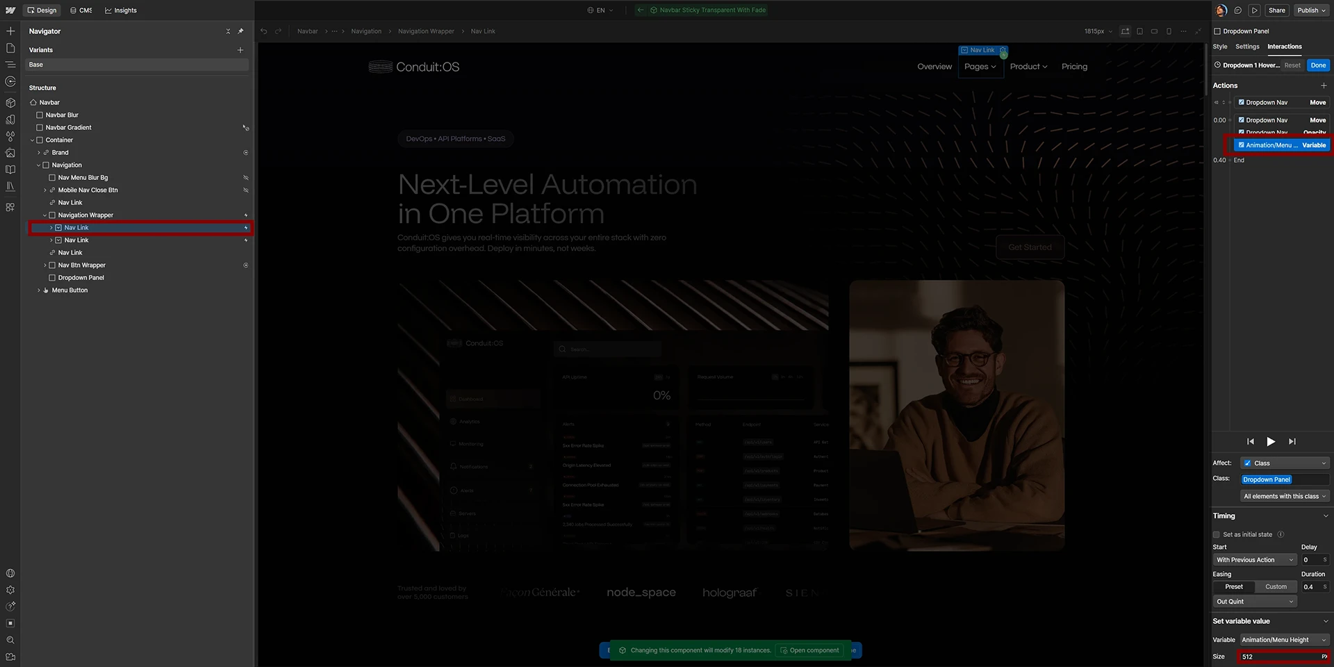
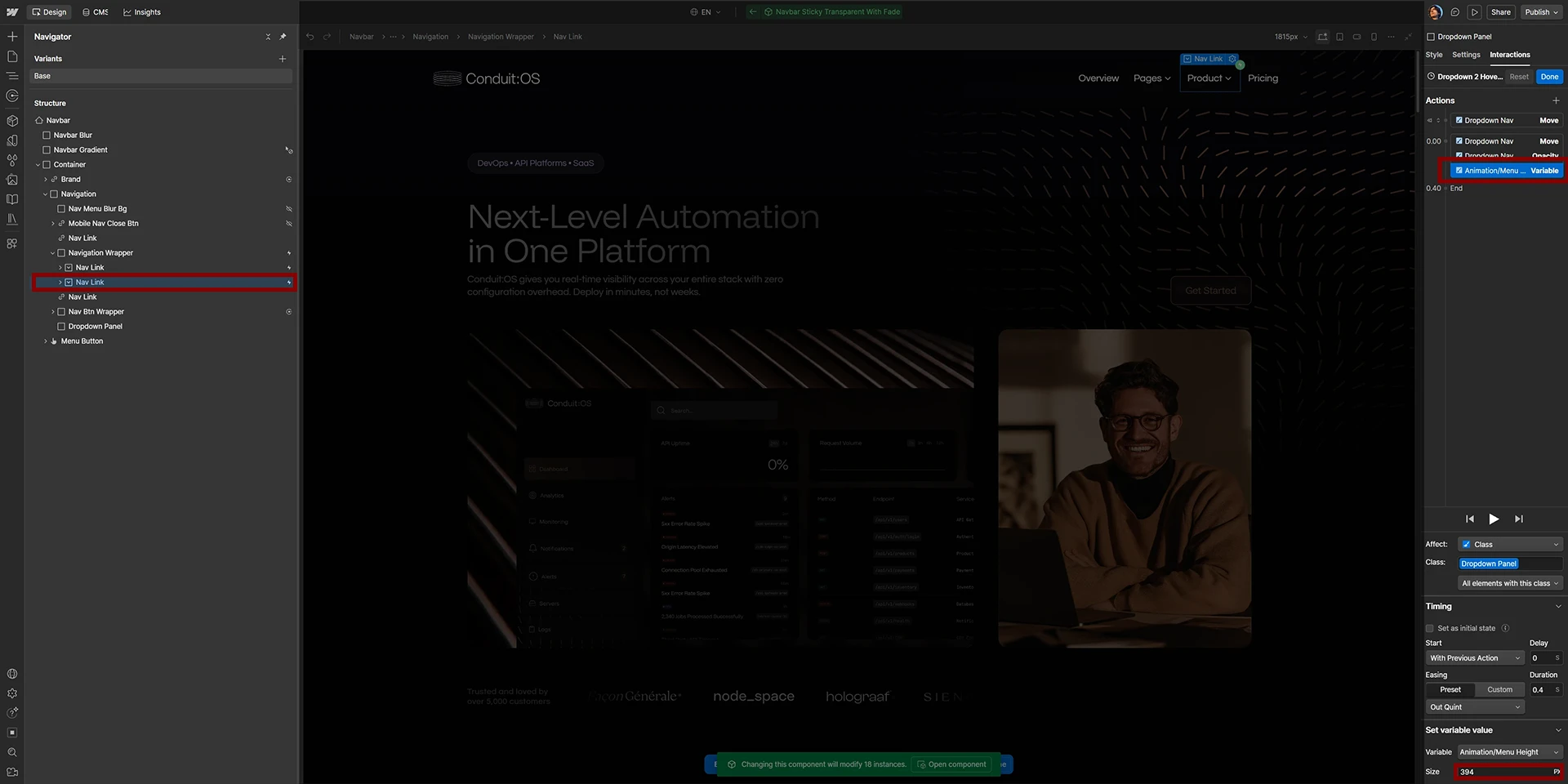
Select the second Nav Link block and open its “Dropdown 2 Hover In” interaction. Find the same “Animation/Menu Height” variable action and enter the height needed for the second dropdown. The two dropdowns can use different values, allowing the shared menu background to resize when you switch between them.
For example, a more compact second dropdown might use 394px. Adjust the value after checking the actual content and padding in Preview mode.
The hover-out interaction on the parent navigation wrapper returns “Animation/Menu Height” to 0px, with a short 0.2-second delay. This closing behavior is shared by both dropdowns. You generally do not need separate hover-out animations on individual Nav Links.
After editing either height, switch between both dropdowns in Preview mode and verify that the panel expands and shrinks without clipping. Then publish and test the live site, including rapid switching and moving completely out of the navbar. If a dropdown still looks too tall or short, revisit that Nav Link’s Hover In interaction and fine-tune its Menu Height value.
The SVG progress bars on Home B use mask properties Inside the Designer through the Style Panel. Their patterned background and gradient fill can be customized directly in the Style panel, while native Webflow interactions handle the bar animations.
On Home B, locate the results/metrics section. The “Progress Results Bar Bg” class provides the SVG pattern. Its nested “Progress Results Gradient” class contains the gradient fill and uses mask-image, mask-size, mask-repeat, and mask-position to reveal that fill through the same bar pattern.
To change the bar pattern, choose a new SVG on the background class, then update the mask-image on the “Progress Results Gradient” class to the matching SVG. Check mask-size and mask-position so the pattern and gradient line up. To change the colored fill, adjust the gradient background on “Progress Results Gradient”. No code edits or custom attributes are needed for the mask.
The bar fill motion is controlled by native Webflow GSAP interactions using the “progress-animate” custom attribute as the trigger/target selector. If you duplicate a progress bar, keep the appropriate interaction target and edit the initial/final bar width in Designer. Preview and publish to check the animation and mask alignment.
Open your project in the Webflow Designer and switch to the Interactions panel. Choose Interactions with GSAP from the version selector if Webflow is showing Classic Interactions. Select an element on the canvas to see its associated animations, or browse the existing interactions from the Interactions manager.
Select an interaction to inspect its trigger settings, the elements it controls, and its animation timeline. Many of Conduit:OS’s interactions are already named by their purpose, making them easier to identify and customize.

Open the interaction you want to adjust, then select the relevant action on its timeline. You can change its duration, easing, delay or start position, and animated properties such as opacity, movement, or scale. On the timeline, drag action blocks to change their order or length.
For a staggered animation, adjust the stagger timing to make items appear closer together or farther apart. Preview the interaction after each change so you can judge the final motion before publishing. If the animation controls several elements, edits may affect every matching target.
Scroll interactions have Start and End positions that determine when the animation begins and finishes relative to the scrolling element and viewport. When Scrub is enabled, the animation follows scroll progress rather than playing on a fixed timer.
For example, Feature Cards Stagger V2 starts when its trigger reaches the center/80% viewport position, while Company Timeline Scroll | Mobile uses a scrubbed range from the top of its section to the bottom. If an animation starts too early or ends too late, adjust its Start and End positions before changing the timeline itself.
A trigger target decides which element starts an interaction; an action target decides which element actually animates. Webflow can target a single element, an entire class, or elements with a specific custom attribute. Keep those targets intact when restructuring or duplicating template sections.
For example, the Home B progress bar interactions use progress-animate="1", progress-animate="2", and progress-animate="3" to identify their separate fills. The customer story card reveal uses customer-story-fade-in. These attributes connect elements to native Webflow interactions rather than the standalone GSAP scripts.
Some animations are tailored to different screen sizes. The company timeline, for instance, has separate Desktop & Tablet and Mobile scroll interactions to account for different layouts and travel distances.
Before editing a responsive animation, check its breakpoint conditions and test the relevant desktop, tablet, and mobile views. Avoid removing one version because another appears to work on your current screen; the second interaction may serve a different breakpoint.
To create a consistent effect elsewhere, start with an existing interaction that behaves similarly to what you need. You can reuse its settings or save an action as a preset from the Interactions panel, then apply it to another element.
Interactions that target a shared class or custom attribute may automatically apply to newly added matching elements. Interactions aimed at a specific element will need their targets updated. When duplicating a component or section, check the copied element’s animation in the Interactions panel instead of assuming every trigger is linked.
Confirm that you are viewing Interactions with GSAP, that the trigger is still assigned to the correct element, and that the action targets exist on the page. For scroll animations, check the Start/End positions and preview the interaction while scrolling through the actual section.
If an element stays hidden or moves unexpectedly, check whether another interaction or custom GSAP script controls the same opacity or transform. Also review breakpoint conditions and hidden actions. Test the published site after making structural changes, especially for scroll-linked animations.
Conduit:OS includes a custom-designed Spline scene that introduces subtle motion to create a more immersive, high-end tech experience.
The custom pill animations are integrated through native Spline elements in Webflow, including the hero backgrounds and feature sections of Conduit:OS. The scenes are already set up in the template; the available customization is changing the pills’ color using their shared Spline material.
The original .spline file is available upon request after purchasing Conduit:OS. Simply contact the template creator after your purchase and request a copy of the Spline scene file.
The file lets you change the color of the 3D pills to better match your brand. Other elements of the scene and its animation are provided as designed.
Open the provided .spline file in Spline. In the material assets, find and select Pills WebGL Native, then adjust its Color setting to your preferred color. This material controls the appearance of the pills, so the updated color is applied to the pills that use it.
Once you're happy with the result, publish or export your updated scene from Spline and update the corresponding Spline scene in Webflow. Only the pill color is intended to be customized; the 3D design and animation otherwise remain as supplied.

Conduit:OS features custom-built Rive animations that bring its dashboards, performance widgets, and product visuals to life. These interactive motion details go beyond standard fades and transforms, giving the template a more polished, product-focused experience. Best of all, their playback is already connected to Webflow’s GSAP interactions, so you can adjust when they play without writing JavaScript.
Rive animations are designed inside a Rive file and displayed in Webflow using a Rive element. In Conduit:OS, the Rive files already contain their own animation logic. Webflow’s GSAP interactions tell those animations when to start by updating a connected data value.
This gives you control over when a Rive animation plays from the Webflow Designer, while the actual visual motion remains part of the Rive scene.
Open the Webflow Designer and select a widget or visual with the Rive Canvas class. You’ll find Rive elements throughout the template, including the dashboards and animated widgets on the home pages.
The custom animations in Conduit:OS are connected to a Rive view model called ViewModel1. Within that model, the numeric property playAnimation acts as the playback control. Setting playAnimation to 1 triggers the animation in the Rive file.
To locate this setup, open the Interactions panel, choose the relevant interaction, and select its Set Rive timeline action. The existing actions target the Rive element and use ViewModel1 → playAnimation = 1. Keep the view model name, property name, and numeric value consistent with the animation’s configuration.

Animations are triggered in different ways depending on where they appear. Hero V1 Page Load, Hero V2 Page Load, and Hero V3 Page Load contain Set Rive actions that start their scenes as the page opens. On Home C, several hero widgets are triggered one after another using different timeline positions.
Other animations play when visitors scroll into view. For example, Feature Trigger Rive | Server Performance uses animate-feature="1" and Feature Trigger Rive | Endpoint uses animate-feature="2". These custom attributes identify the scroll triggers; the corresponding Set Rive actions send the value 1 to the connected Rive scenes.
Check that the Rive element has the correct file assigned and that its Set Rive action still targets the right element. Confirm the animation source points to ViewModel1, the property is spelled playAnimation, and its value is the number 1 rather than text.
Conduit:OS gives you complete control over the motion in your website. Whether you prefer a more minimal experience, want to simplify a particular section, or need to replace an animation with your own, you can adjust or remove its effects without rebuilding the layout. The important part is identifying what controls the animation before making changes—some effects are managed visually in Webflow, while others use custom scripts or embedded scenes.
Before changing anything, select the animated element in the Webflow Designer and check its Interactions panel and Custom attributes. Conduit:OS uses native Webflow GSAP interactions, attribute-based GSAP scripts, Rive animations, and Lenis smooth scrolling. Each is controlled differently.
If you only want to stop an animation on one element, remove its individual trigger where possible. Changing a site-wide interaction or script can affect the same animation across multiple pages. We recommend keeping a backup before removing shared effects.
Select the element in the Designer, open Interactions with GSAP, and locate the animation attached to it. You can remove its trigger or edit the interaction if you no longer want the effect. This applies to page-load reveals, hover effects, scroll animations, and other effects built visually in Webflow.
Check whether the interaction targets a single element, a shared class, or a custom attribute before deleting it. For example, Job Listing Card | Hover is a reusable card effect, whereas the various Hero Page Load interactions control entire entrance sequences. Removing one shared interaction can change other elements that rely on it.
To disable an attribute-driven custom GSAP animation on one element, remove its relevant attribute. The active script attributes include fade-in-per-word, random-float, and count-up. Removing one attribute disables that effect on the selected element without affecting other matching elements.
Some native Webflow interactions also use attributes as triggers, such as customer-story-fade-in or progress-animate="1". Removing the attribute stops that trigger from matching, but you may also need to adjust the element’s initial state so the content remains visible.
To disable one site-wide custom GSAP effect, open Site Settings → Custom Code → Footer Code and remove the corresponding script block after making a backup. Keep the other scripts and required libraries intact. Do not remove the entire footer code if you only want to stop one animation.
For example, removing the Random Float script stops its floating motion site-wide. The mega menu and SVG progress bar mask are not controlled by footer scripts; edit or disable those features through Webflow Designer. Consult the Custom GSAP Scripts section to identify the remaining script blocks.
Conduit:OS triggers its custom Rive animations through Webflow’s Set Rive actions. These set ViewModel1 → playAnimation to the numeric value 1. To stop a specific animation from being triggered, find the corresponding Set Rive action in the GSAP interaction and remove or change that action.
Avoid deleting an entire Page Load or feature-scroll interaction if it also controls other text, widgets, or layout effects. If you no longer want the Rive visual at all, remove or replace its Rive element separately. Depending on the file, stopping the trigger may leave the scene showing its default frame.
To return to normal browser scrolling, go to Site Settings → Custom Code → Footer Code and remove the Lenis initialization block containing new Lenis(...) and its requestAnimationFrame loop. The standalone GSAP animations can remain in place.
If you will not use Lenis anywhere, you can also remove its Lenis 1.3.4 library and stylesheet from Head Code. Both snippets are documented in the separate Lenis Smooth Scroll section, so you can restore them later.
For an animated scene that you no longer need, such as a Rive visual or Spline embed, select its element in the Webflow Designer and remove or replace it with a static image. Check the parent wrapper and any animations that target the scene so the surrounding layout still looks intentional.
Hiding a scene can be useful for testing, but removing an unused embed or asset reference is the cleaner solution when the animation is permanently retired. Be careful not to remove a shared component that is still used elsewhere in the template.
Some animations begin with elements hidden, moved offscreen, or set to zero before their trigger runs. Removing the trigger does not always restore the final appearance. If content disappears after disabling an interaction, check its opacity, visibility, transform, display settings, and any separate default-state interaction.
This is especially important for the progress bars: Progress Results Bar | Set Default and the individual scroll-triggered bar interactions work together. If you disable the fill animation, make sure the bar has an intentional static width instead of remaining empty.
After making changes, preview and publish to a staging or live site, then check desktop and mobile layouts. Confirm that the content remains visible, navigation works, and no remaining interactions depend on the effect you removed.
Conduit:OS is built to be easy to customize and maintain, even as your website grows. A few simple checks will help you preserve the template’s design, keep its animations running smoothly, and avoid common issues when publishing. Use these guidelines as a final reference whenever you edit the project or prepare a new page for launch.
Before making significant changes to the template, create a backup or work in a duplicate project. This is especially useful when adjusting shared components, reworking complex sections, or modifying custom animation scripts.
Keep a copy of any original code you plan to change. That way, you can experiment with the layout and interactions while still having a reliable version to return to if something stops working.
The template’s design system is managed through Webflow Variables. Use the Base, Colors, Text, and Spacing & Layout collections when making site-wide updates to fonts, colors, typography, or spacing. This keeps your changes consistent rather than introducing slightly different styles on each page.
Remember that editing a shared class or variable may affect several sections and pages at once. If a change looks right in one place but wrong elsewhere, check where that class or variable is also used before overriding it.
Many animations in Conduit:OS rely on a connection between their target and trigger. Attributes such as count-up, fade-in-per-word, and random-float activate custom GSAP scripts; progress-animate identifies native Webflow bar interactions. Dropdown menu heights are controlled by the Animation/Menu Height variable in the linked Hover In interactions.
When duplicating or restructuring an animated section, preserve its required attributes and target elements. If you rename a custom attribute or change which element an interaction targets, the effect may stop working. For Rive scenes, keep the matching ViewModel1 → playAnimation = 1 setup unless you deliberately change the scene’s controls.
Some sections use different layouts or interactions for desktop and mobile. The navigation, feature timelines, and scrolling sections are good examples. Always check desktop, tablet, and mobile views after editing their structure, spacing, or animation targets.
Pay particular attention to sticky elements, overflow wrappers, and scroll distances. A section that works perfectly on a large screen may need different trigger positions or movement values on mobile. Test the complete scroll sequence instead of checking only its initial appearance.
If an animation is not playing, first determine whether it is controlled by a Webflow interaction or a custom script. For native interactions, check the trigger, timeline, targets, and breakpoint settings. For custom GSAP effects, confirm the correct attribute is present and the required script is still included in the site’s custom code.
If content is unexpectedly invisible, inspect its opacity, visibility, display, transforms, and initial animation states. Some elements begin hidden and only become visible when a trigger runs. Also check whether two interactions are trying to animate the same property, especially when combining native GSAP effects with custom scripts.
When an effect behaves differently in Designer and on the live site, republish and test the actual browser output. Check for overlapping interactions, differences in initial state, and whether multiple animations target the same class or variable. For dropdowns, confirm that switching between both menus restores the correct Menu Height value.
Conduit:OS includes external motion assets and libraries such as Rive, Spline, Lenis, and GSAP. When replacing an animated visual, confirm that its file or embed is still accessible and that its dimensions fit the surrounding Webflow layout.
If you replace a Rive scene, ensure any Webflow Set Rive interaction still matches the view model and property names in the new file. If you remove a library or embed, verify that no other section still depends on it.
Keep motion purposeful. If a page feels too busy or heavy, simplify unnecessary animation layers